The above movie shows MPGAfold, the MPGAfold Visualizer, and StructureLab running in unison. MPGAfold is running in the background and is transmitting its data to MPGAfold. This data includes information to create the fitness and trace maps to populate the various windows. The MPGAfold Visualizer then takes some of this information and passes it to StructureLab. StructureLab uses the information to draw the secondary structure in the structure display window.
The sequence used during the run was not chosen at random; the sequence was taken from part of the HIV sequence.
Important Images and Remarks
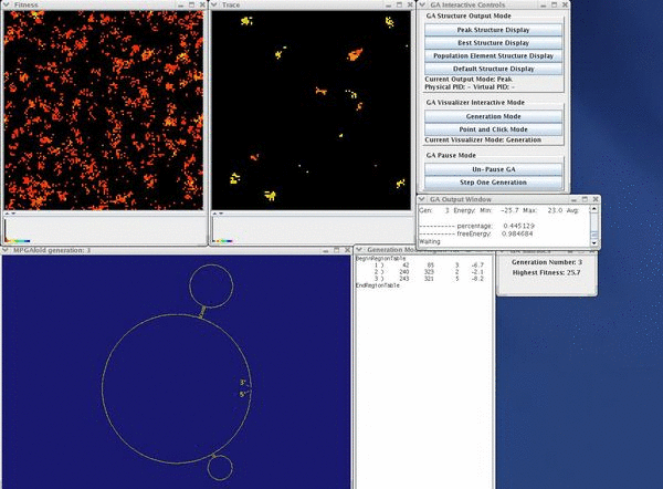
When MPGAfold begins, all structures start with bad fitness. The screenshot to the left depicts this fact. The fitness map consists of mainly red, orange, and yellow pixels, which represent population elements with poor relative fitness. The peak structure drawing confirms the the state of the population depicted in the fitness map; the secondary structure consists of very few stems and large loops. The stabilizing effect of the few stems is lost due to the occurence of large loops. At this point in the run, the majority of the trace map is black with a few occurrences of the traced stems.
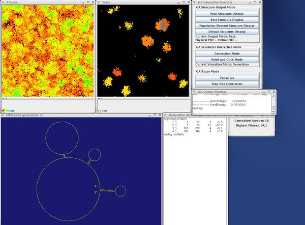
While still immature, the population has attained a better fitness than the previous run. The green, indigo, blue, violet, and pink pixels in the fitness map demonstrate the better level of fitness. Additionally, the secondary structure drawing now includes a greater number of stems and fewer loops. Additonally, one of the stems in the drawing corresponds to a stem being following throughout the run. At this point, the trace map shows that a greater number of population elements contain one of the followed stems. The stems represented by the two shades of orange have become dominant. Furthermore, some population elements contain both of these stems, which accounts for the emerging gray area.
At first, this frame along with subsequent frames may seem confusing. Despite the negative color change of the fitness map, the population has a better fitness level. The fitness map contains black, red, orange, and yellow pixels not because the fitness of the population has been reduced, but because the fitness map's color threshold has been adjusted to better see energy discrepencies between population elements. If the threshold had not be adjusted, the enteire fitness map would be pink. The structure drawing and trace map continue to follow the current trend; the drawing contains more stems and less loops and the trace map depicts more population elements containing the followed stems.
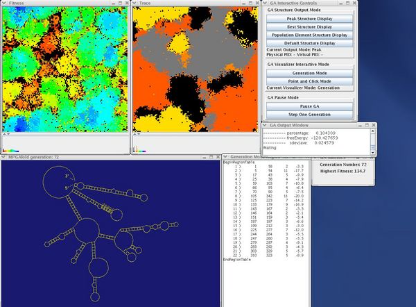
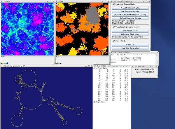
Once again, some areas of the fitness map have turned a deep blue, mainly the top and bottom left corners of the map. Looking at the trace map, both of areas of deep blue correspond to the yellow areas suggesting some type of relationship between low fitness and the stem represented by yellow. This connection will be made clear in further frames. The structure drawing contains one of the labeled stems. Additionally, it lacks the large areas of un-paired bases apparent in the preceding frames. The drawn topology is very similar to the branched conformation of HIV.
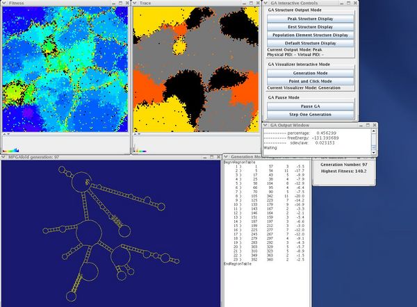
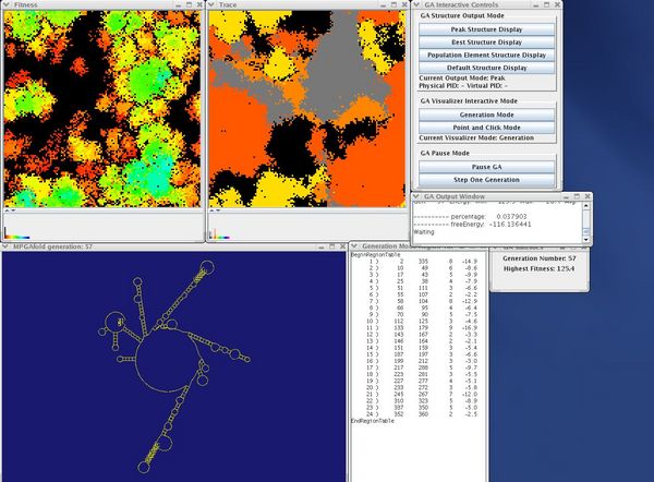
The fitness and trace maps in this image depict the relationship between low fitness and the stem represented by yellow pixels better than the last frame. The deep blue areas in the fitness map and the yellow areas in the trace map have spread to all four corners of their windows. In the middle of the trace map, the large grey area of pixels represent population elements that have assumed the branched HIV conformation consisting of two traced stems. This conformation is depicted in the structure drawing window as the peak structure of the current generation.
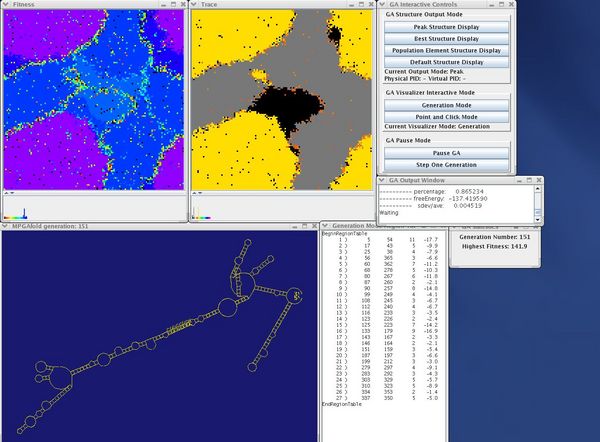
The correlation between the LDI stem and low fitness that the last frame hinted at is now obivious in this image. Any yellow region on the trace map has an associated purple region on the fitness map. The blue areas of the fitness map correspond to the grey and black areas of the trace map. Note that surrounding each purple region of the fitness map is a thin line of yellow, orange, and green pixels. These pixels depict the existence of an energy barrier between the linear conformation of HIV (yellow on trace map) and the branched conformation of HIV (grey on trace map). Since the linear conformation of HIV has a better fitness than the branched conformation, the branched structure will eventually fold into the linear structure. To do so, the branched structure must unfold (thus attaining a worse fitness) and then refold into the linear conformation of HIV. The energy barrier shows this unfolding and subsequent refolding. The structure display window depicts the linear conformation of HIV.
This image depicts the population converging on the linear conformation of HIV. After several more generations, MPGAfold will stop and the solution secondary structure will be the linear conformation of HIV, as depicted in the structure display window.